Ara Yahya


🌾
What is Cropinno?
Cropinno is a precision agriculture platform that uses satellite imagery and AI to help farmers monitor crop health, detect stress early, and take real-time action. It was designed for small- to mid-size farms that often lack access to affordable, easy-to-use digital tools.
Tools
Figma
FigJam
Zoom
Notion
Maze
Team
2 Founders
2 Developers
2 UI/UX Designer
Roles
User Research,
UX Design
Interface Design
🧩 Challenge
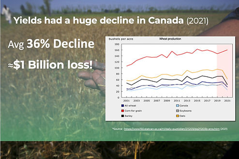
Farmers typically discover crop issues too late—when it’s already affecting yield.
📉 In 2021, Canadian farms faced a 36% drop in yield, resulting in nearly $1 billion in loss (StatsCan, 2021).
Small and mid-size farms — which lacked access to advanced tools — were hit the hardest.
Satellite data was available, but it wasn’t usable: most platforms were complex, slow, or expensive. Farmers needed timely insight, not dashboards built for analysts.
\
🎯 UX Goal
Design an AI-powered decision-support platform that empowers farmers to:
-
Identify crop stress before visible symptoms appear
-
Take timely, informed actions using satellite-based alerts
-
Adopt technology with confidence, regardless of technical background
The product needed to deliver clarity, speed, and trust — turning complex data into simple, high-impact decisions in the field.
Solution Preview

Change Detection
“Spot critical field changes using satellite imagery.”

Crop Monitoring
“Track crop health across your entire farm — remotely.”

Crop Mapping (Classification)
“Visualize field boundaries and identify different crop types.”
Process Overview
01 Discovery
02 Design Approach
03 Solution
04 Usability Testing
05 Results and Insights
01.Discover
#Understanding the Satellite System

Before jumping into user interviews, I took time to understand how satellite imagery powers Cropinno’s crop health tracking.🌱
The platform uses reflected solar radiation (via satellites) to analyze vegetation and soil condition. This technical immersion helped me:
-
Ask better questions during research
-
Design more relevant map features
-
Collaborate confidently with our satellite science team

User Interview 🧑🌾
I needed to understand farmers’ real challenges.
Before designing, I conducted 4 in-depth interviews with farmers across small to mid-sized operations, investigating:
-
How they monitor crop health
-
What tools they use now (if any)
-
How they respond to crop stress
-
What frustrates them in the field
Structure:
-
Method: Semi-Structured Interviews
-
Location: In-person, conducted on-site at participants' farms
-
Participants: 4 farmers managing different field sizes and crops
Interview Criteria:
-
At least 2 years of farming experience
-
Hands-on decision-makers (fertilizer, irrigation, rotation)
-
Varying levels of tech confidence (from low to moderate)
-
No heavy reliance on high-end agri-tech tools

🔍Research Insights
All interview notes were synthesized and categorized into key behavioral themes and pain points. I used affinity mapping in FigJam to surface shared struggles and design opportunities..
📌 Key Findings & Takeaways
Findings
Farmers need to spot problems before it's too late.
💬 “By the time we see something, it’s usually already bad.”
01
Solutions
Build a satellite-powered early stress alert system to notify users of invisible changes before symptoms appear.
02
Help must be real-time and in-the-field.
💬 “I don’t have time to check data on a computer during planting.”
Design for on-the-go use, with a mobile-first layout and just-in-time AI recommendations.
03
Complicated software is avoided or abandoned.
💬 “If I have to figure it out too much, I won’t use it.”
Prioritize visual clarity, color-coded maps, and a guided experience. Reduce interface friction.
04
Unfamiliar terms erode trust.
💬 “What’s NDVI supposed to tell me, exactly?”
Replace technical language with clear, relatable terms.
Farmers want to confirm or clarify alerts easily.
💬 “Sometimes the alert is right, but sometimes I need to explain more.”
05
Add a one-tap feedback input under each alert. This lets users either confirm or quickly describe what’s really happening in the field.
Farmers appreciate helpful defaults, but want flexibility when needed.
💬 “If it works without me doing much, great. But let me tweak things later if I need to.”
06
Offer smart initial settings, with the option to adjust layers, map views, and notifications later — only if the user wants to.
02.Design Approach
What Guided My Design
⚡ Keep it fast
Every flow had to be quick and easy to use — even while walking through a field with limited signal.
🔍 Make it clear
I replaced terms like “NDVI” with simpler ones like “Greenness Level” or “Best Productivity.” That small change built trust instantly.
🧠 Don’t overload
I surfaced just what the user needed upfront, with the option to go deeper only if they wanted to. Less noise = better action.
How We Worked Together
This was a deeply collaborative build:
-
Worked closely with satellite analysts to make sure maps actually reflected field reality
-
Met weekly with devs to keep designs responsive, light, and offline-friendly
-
Used Figma and Maze to test flows and wording early — so we didn’t waste time designing the wrong thing
What I Designed
These were the core flows that shaped the product:
-
Adding and managing a field
-
Viewing health data through satellite layers
-
Responding to crop stress alerts
-
Comparing productivity over time
How I Designed
Some of the methods and tools I used along the way:
-
Lean UX — fast testing, fast learning
-
Fitts’ Law & Hick’s Law — made every tap faster and easier
-
Accessibility-first defaults — clean, bold, readable
-
Weekly feedback loops — used FigJam, Maze, and in-person reviews to stay grounded
🛠 Core Task Flow
(Add a Field)
Before jumping into features, I designed the core journey that every farmer would go through first:
adding their field.
This flow had to feel natural, forgiving, and quick — even for someone using the platform for the first time, in the middle of a field.

Key design decisions in this flow:
✅ Map-first layout for familiarity
✅ Flexible entry points (search, scroll, tap-to-draw)
✅ Smart nudges to guide the process (e.g., when satellite isn’t available)
✅ Confirmation before save — no accidental overwrites
This core flow became the foundation for everything else: alerts, health tracking, zone management, and reporting.
03.Solutions
Every feature was a response to a real farmer need.
Draw your field
Farmers can draw and save their own field boundaries directly on the map — no technical tools required.
✅ Visual layers update automatically using satellite data.
"We wanted to make onboarding feel like drawing on paper — fast, intuitive, and farmer-friendly."
.png)
Field Monitoring
Farmers could instantly check satellite-based maps (NDVI, Moisture, Greenness) to monitor crop health — zone by zone.
✅ No guesswork. Visual layers made early signs of stress easy to spot.
“I just opened the app and knew where to go check.”

Some growers wanted deeper insight — not just alerts. For them, we included advanced satellite layers:
✅ NDVI (Normalized Difference Vegetation Index)
✅ Greenness
✅ Moisture levels
This was especially useful for:
• Experienced users managing large fields
• Off-season planning and long-term tracking
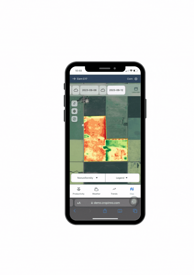
Productivity Map
Farmers could instantly compare zones with high and low performance — based on satellite data over time.
✅ Quickly spot weak areas or sudden changes
✅ Data refreshes automatically throughout the season
✅ Supports early decisions before yield loss occurs
“I could tell which parts of my field were underperforming — without walking the whole thing.”

.png)

Health Alerts
Farmers got real-time notifications when crops showed signs of stress — based on satellite and AI signals.
✅ Alerts showed exactly which zone needed attention
✅ Clear, color-coded messages (red = act now, green = all good)
✅ Optional note field helped farmers explain what they saw
“I didn’t need to guess. I just checked the alert and knew what to do.”
.png)
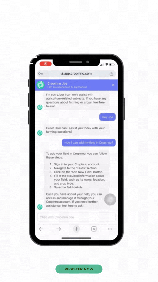
Ask Joe – Your AI Agronomist
Farmers could chat directly with “Joe,” an AI-powered assistant trained on agriculture.
✅ Instant answers to questions like “How do I add my field?”
✅ Friendly, step-by-step support — no need to call or search
✅ Built-in right inside the app — always available, 24/7
“It felt like talking to a real agronomist — but faster.”
04.Iteration & Usability Testing
Method:
4 in-person sessions with farmers on their own devices (May 2025)
Think-aloud protocol while completing key flows:
• Add a new field • Check stress alerts • View productivity zones • Export a seeding plan


Renamed to “Best Productivity” based on real farmer feedback.Added unit toggles (kg/ha, lbs/acre) for flexibility
“These small changes helped make the screen more accessible and easier to trust.”
📌 We also moved this map to its own section — it was originally buried under Monitoring.
Initial
Revised
Alerts didn’t allow farmers to explain what they saw.
We added a short input field for quick notes.
✅ Helped us capture valuable insights
✅ Improved system accuracy over time
🟢 “After testing this alert screen with farmers, we realized they wanted a simple way to be heard.”


Initial
Revised
Outcome
-
Faster task completion in second round of testing
-
Increased user confidence and engagement
-
Positive feedback on simplicity and speed, especially from less tech-savvy farmers
05.Results and Insights
✅ Faster decision-making:
Farmers reported making field adjustments 3× faster after using the Productivity Map.
✅ 60% time saved
Simplified flows reduced fieldwork and made reporting faster.
✅ Increased adoption:
The simplified onboarding (Draw Your Field) led to a 20% increase in new field submissions during pilot testing.
✅ Useful feedback loop:
The alert input field captured real-time insights, which helped refine the algorithm and build trust.
Recognition & Impact
This project was recognized on multiple platforms:
✅ Runner-up in the Space App Hackathon (NASA/CSA)
✅ Selected as a Top 30 finalist by the European Space Agency
✅ Semi-finalist at GITEX Dubai Innovation Challenge
What made this meaningful wasn’t just the awards —
it was seeing real farmers adopt the tool, use it in the field, and trust it for daily decisions.

🌱 Final Thoughts
Building for Cropinno wasn’t just about maps or metrics
it was about designing clarity for farmers in the field.I learned how much language, simplicity, and visual trust matter when users are on the go often offline, often busy.Every icon, label, and screen had to earn its place.
💡 Key takeaway
Good UX isn't about more features
it's about giving users just what they need, right when they need it.